Musician Magazine – Guns N' Roses Feature Article Project
Published on
Reading Time
2 min

Introduction
This project consists of a professionally designed magazine spread featuring an original article about Guns N’ Roses. It combines editorial writing, layout design, visual storytelling, and print production.
Roles & Tasks
Article research and writing, photo editing, magazine composition, layout design, color and type hierarchy, and print prepress preparation.
Objective
To design an editorial magazine layout that communicates cultural relevance, narrative impact, and visual balance using professional design and publishing standards.
Tools
InDESIGN, PHOTOSHOP, LIGHTROOM
Techniques
Editorial composition, photo correction, publication design, visual pacing, headline treatment, and long-form print formatting.

Approach
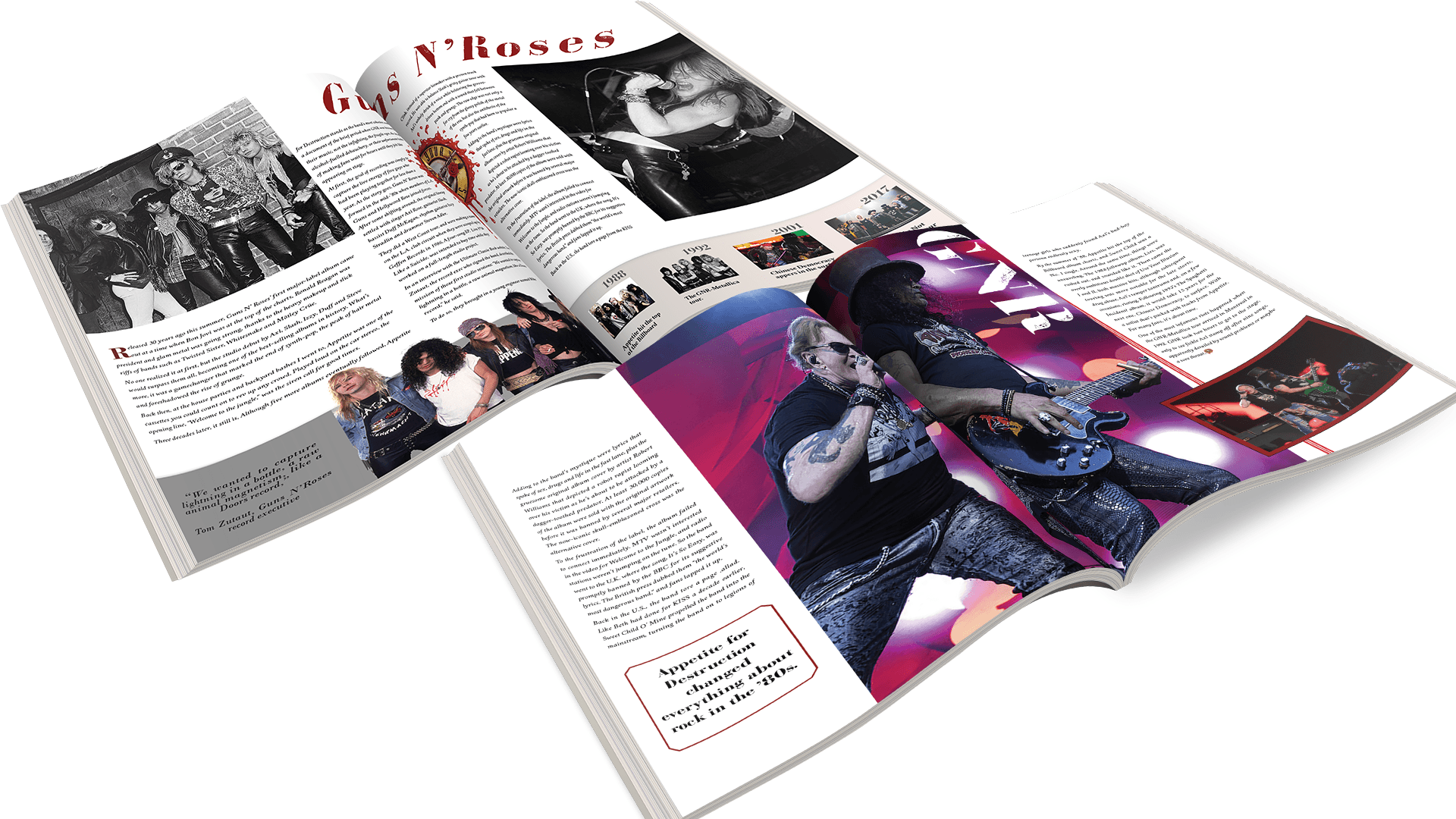
We combined technical layout structure with creative storytelling. Through careful image selection, text rhythm, typographic hierarchy, and balanced column design, the magazine spread emulated the aesthetic of a real-world music publication.
Process
Visual concept and moodboard
Research and article synthesis
Layout sketches and typographic pairing
Image editing and composition
InDesign grid application and master page use
Final export and print prepress setup
Final Design & Achievement
The result is a 4-page editorial spread featuring original photography treatment, strong grid-based layout, text-image integration, consistent branding, and layered typographic styles—delivered as a press-ready, print-optimized file.
The visual tone of this editorial celebrates chaos and structure in equal parts—just like the band itself. From sharp image cuts to controlled type alignment, every detail contributes to a layout that feels loud, alive, and print-worthy.
Successfully produced a professional-grade print spread integrating storytelling, visual hierarchy, and real-world publishing practices—meeting both editorial and aesthetic goals.
Design Key Objectives
Reflect the band’s edgy identity through graphic elements
Create visual rhythm that supports long-form reading
Maintain professional publishing standards in print layout
Visual Impact Statement
A good editorial layout should visually echo the tone of the story. This piece embraces the raw, rebellious energy of GNR through bold typographic contrasts, grunge-inspired textures, and dynamic spacing that captures the intensity of the era.